
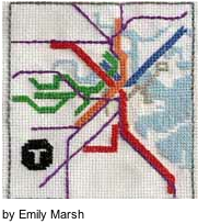
Transit maps are one example of graphic displays that require the viewer to rapidly process visual information to make quick decisions in often crowded and noisy conditions.

MBTA Map 2013
Cognitive scientists have studied this type of challenging task load in human performance, but seem not to have been consulted when Boston’s Massachusetts Bay Transportation Authority (MBTA) sponsored a contest to redesign the system map in Spring 2013.

Michael Kvrivishvili
Michael Kvrivishvili, a graphic designer at Moscow’s Art Lebedev Studio, submitted the winning design, which was judged by aesthics and presumed usability.
MIT’s Ruth Rosenholtz, Lavanya Sharan, and Shaiyan Keshvari empirically scrutinized Kvrivishivili’s design using computational modeling to analyze the design’s potential visual clutter and its impact on peripheral vision.

Ruth Rosenholtz
Team Rosenholtz’s model generated “mongrels,” or alternate representations of Kvrivishvili’s redesigned subway map, that abbreviate and abstract visual elements like color, text, space, line orientation before processing in the visual cortex.

Lavanya Sharan
Mongrels can account for peripheral vision’s generalized synthesis of information outside direct line-of-sight, which provides an overall impression while sacrificing details to speed information processing.

Shaiyan Keshvari
Their analysis recognized the many positive elements of Kvrivishvili’s design and noted opportunities for design optimization.

Amal Dorai
Rosenholtz’s earlier collaboration with MIT colleague Amal Dorai and Rosalind Freeman of Skidmore College evaluated the effectiveness of Dorai’s DesignEye tool to assist designers with this type of human factors optimization.

MBTA 2013 by Behr-Harnot
DesignEye tool enables A/B comparisons between designs and judgments about the quality of a design through simple design visualization.
Design optimization seeks to remedy effects of visual clutter, or excessive and disorganized items that can cause:
- Crowding
- Masking
- Reduced recognition due to occlusion
- Decreased ability to segment scenes
- Poorer visual search performance.
 Rosenholtz’s group investigated reliable measures of visual clutter to help designers optimize displays for more effective information processing.

Jeremy Wolfe
Among them are Jeremy Wolfe of Harvard’s Guided Search metrics, which measure reaction time (RT), errors, and distinguishing a single item in a crowded visual field provided an alternative to an earlier measure, “set size.”

Yuanzhen Li
Rosenholtz’s MIT colleagues Yuanzhen Li, Jonathan Mansfield, and Zhenlan Jin evaluated a revised version of her earlier Feature Congestion metric that focused on color and luminance contrast to consider the a new item’s distinctiveness in a crowded display to draw attention.

Michael Mack
They also assessed Subband Entropy, a measure of visual information in the display, and Edge Density, used by University of Texas’s Michael Mack and Aude Oliva of MIT to evaluate subjective visual complexity.

Aude Oliva
Cognitive science research focused on visual and auditory processing can be applied to optimize human performance through improved usability in many technology and graphic user interfaces.

Eric Johnson
Eric Johnson of EMC Computer Systems and a veteran of several Silicon Valley high tech companies, builds on these empirical findings and addresses the challenge of reducing visual clutter with a the ancient practice of feng shui in the workplace.
-*How do you reduce visual clutter in your work environment?
 -*What cues do you seek when navigating complex systems like subway systems?
Please follow-share-like www.kathrynwelds.com and @kathrynwelds
RELATED POSTS:
Career Navigation by Embracing Uncertainty
Pattern Recognition in Entrepreneurship
Twitter: @kathrynwelds
Blog: – Kathryn Welds | Curated Research and Commentary
Google+ google.com/+KathrynWelds
LinkedIn Open Group Psychology in Human Resources (Organisational Psychology)
Facebook Notes:
©Kathryn Welds

Pingback: Watching Yourself in the Mirror – Illusions and Therapies | Kathryn Welds | Curated Research and Commentary
Pingback: An End to “Death by PowerPoint”: Neuroimaging Studies Improve Visual Display Design | Kathryn Welds | Curated Research and Commentary